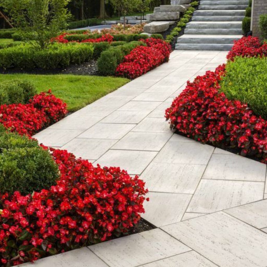
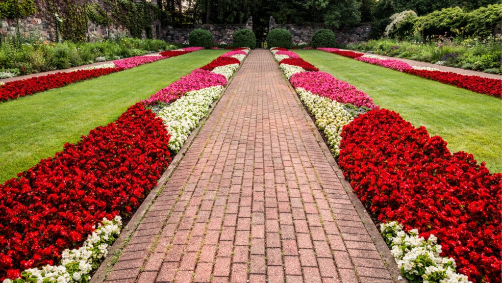
How would your garden take advantage of those beautiful colors? The answer is composition is essential for it to be in visual balance. With these tricks, you will learn to combine the colors in your garden.
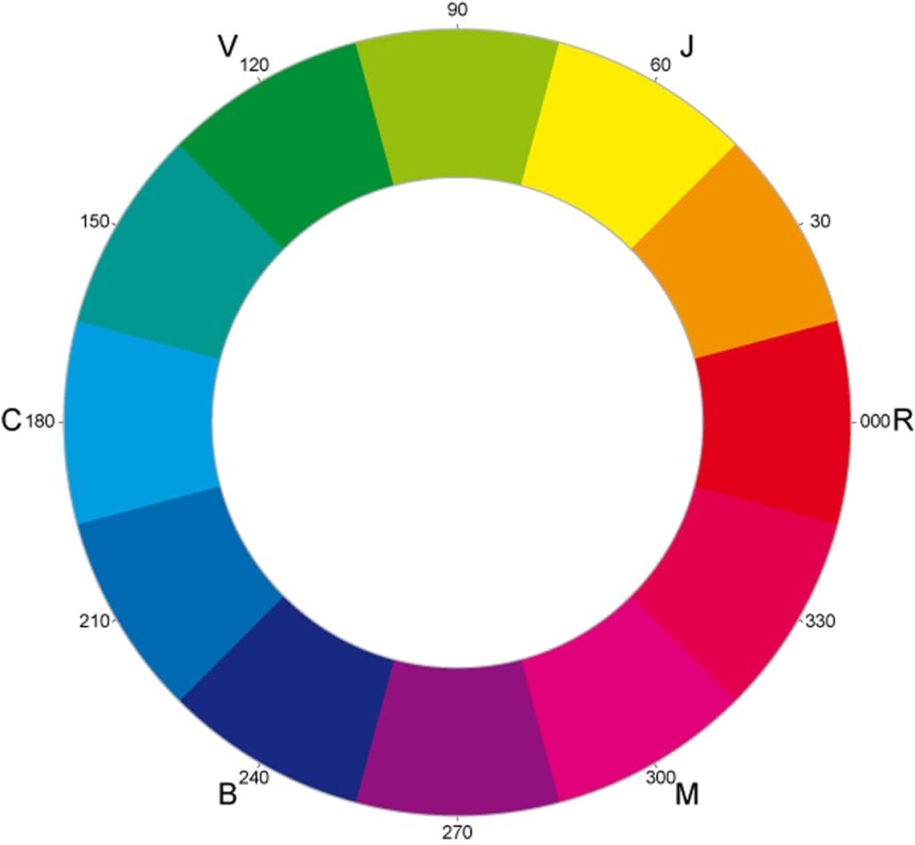
The first thing we must learn is to use a color wheel. Despite the variations, we can use the triquetra with the primary colors. This tool can give us various combinations.
Guide to possible combinations
Analogous Colors
These will be the color combinations the ones next to your choice. We can choose; cold or warm tones:
The cold ones: blue and green.
The warm ones: reds and yellows.
Your gardens will have a very different vibe if you choose to decorate them with elements that prevail in one tone. And it will vary according to the appearance you want to give to your garden, a warmer and more welcoming look or a refreshing and spacious feeling.
Complementary combination
There is also the complementary combination, using the color opposite the color wheel of the first tone you chose.
It will make your garden stand out much more, since the purpose of this combination. Allow warm colors to take center stage by completing it with cool tones.
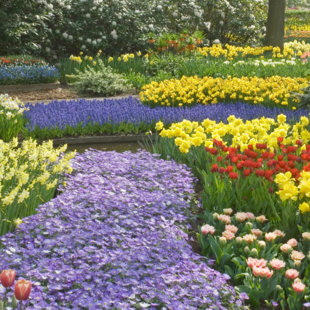
Neutral colors:
They are perfect if you prefer the minimalist style; they are always an excellent and safe bet. Anyone can use black, gray, and white you should remember that contrasts are everything. Each element needs to get focused individually, so you should play with bright and dark tones. In the same way, colors with less saturation from the same color wheel will continue to work with the combination of contrasts.
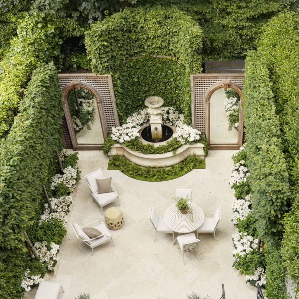
Monochrome composition:
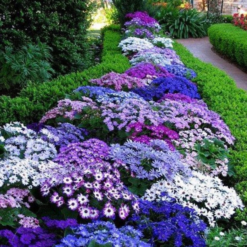
Finally, if we talk about shades, you can use the same color to decorate a garden. If you wonder how to make this work, the key is to generate a palette of colors that vary in saturation or brightness; in this way, apply the same technique with neutral colors.
Finally, we do not forget to vary the textures will influence how we perceive colors.
Remember that colors emit different emotions. You always have to make sure that you transmit what is necessary. And this is achieved through the correct use of colors.
